Showing posts with label Twentieth Century. Show all posts

December 13, 2019

1950s Smart Homes and the Longevity of Design

Aesthetic modes can be surprisingly persistent, even as technologies change.

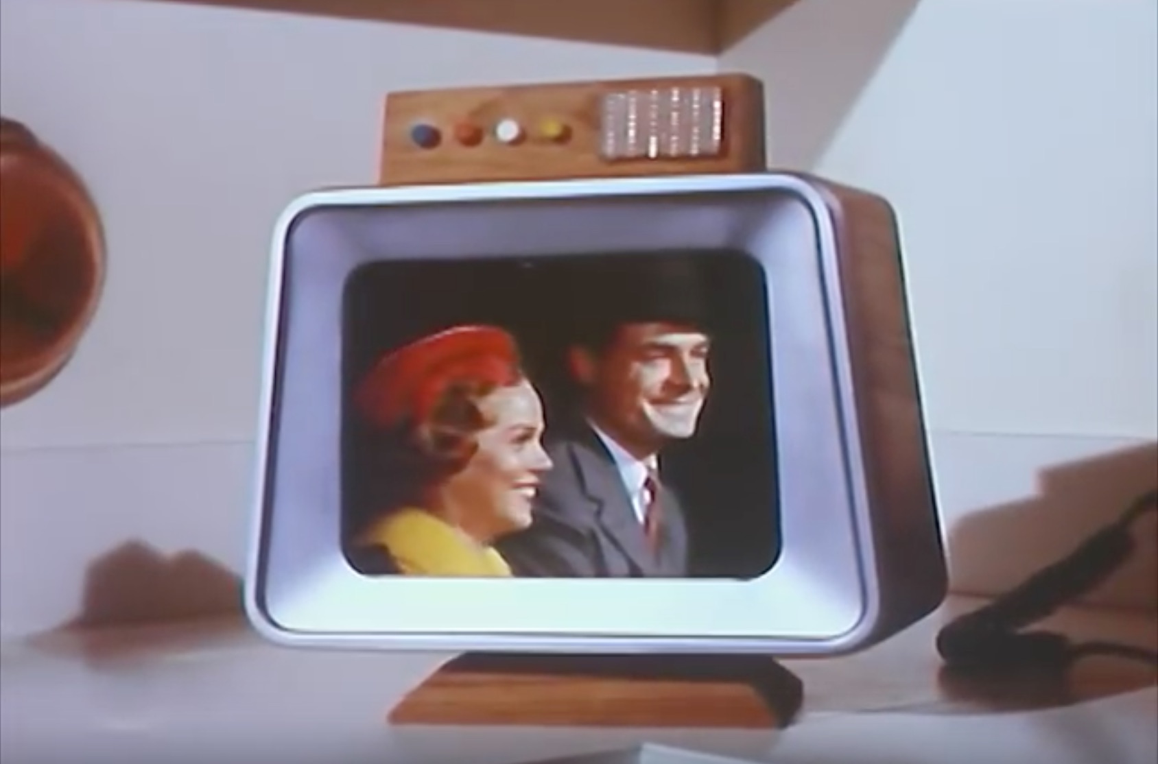
Electric light strips automatically illuminate as the young couple approach the house's front steps. They pause before a pearlescent circle embedded in the wood of the door – it's a tiny security camera, beaming their image onto a screen on the kitchen counter within.

Following a push-button approval from the woman inside, the door unlocks automatically. Success!
Image
These are screenshots from a promotional film made by the Westinghouse Corporation in the mid 1950s. The film advertised Westinghouse's vision of the "Total Electric Home": one of the earliest and most detailed previews of what is now known as a smart home.

This home of the future doesn't just use technology to heat, cook, cool, and light. It also "entertains, encourages hobbies, makes it the easiest way ever for you and your family to be happier, healthier, to live fuller lives."

According to an accompanying booklet,
When guests approach your Total Electric Home, a soft glow of Rayescent (TM) lamps along the entrance path guides them up to the entrance. Additional lights go on automatically as they come near... When guests arrive at the door, a television camera takes their picture and transmits it automatically to closed-circuit monitors located throughout the house. As you view your guests, you'll be able to welcome them over the voice intercom.
Some of the innovations inside the home are not terribly impressive, even from the perspective of the 1980s.

For instance, the promotional video boasts that “the temperature of each room in the Total Electric Home can be set individually," via this overly-complicated "weather control center."

"The pride and joy of the man of the house is the 'weather control center.'"

 The barometric pressure read-out and the sidewalk de-icers are kind of cool, I guess:

"In summer, an automatic sensor starts the lawn sprinkers when the lawn gets thirsty."  

To my eyes, though, the actual smart home technology in this section looks garish and seems difficult to use. On the other hand, the blonde wood panelling on the walls is, to me, timeless and appealing.

The situation is similar when it comes to other parts of the house: bold technological claims that would sound prosaic within the lifetimes of the actors involved. The film hypes the washer/dryer unit as a "program computer... that can think," but it's actually just a push-button system that has different settings for different types of clothing.

"It’s the first home laundry… that can think.”

By contrast, the combination barbecue and fireplace (!) looks far less dated than the other elements in the house, as does the beautiful living room. The most futuristic elements of this home aren't the "thinking machines" – they're the elements of mid-century modern design, mostly made out of age-old materials like copper and wood. 

Detail from a Westinghouse promotional brochure.

The whole video is worth watching in full – don't miss the microfilm cookbook in the kitchen.

The Westinghouse Electric Home shown in this film was for show, but many elements of 1950s smart home design aesthetics and technology did end up in production. 

The science fiction author Robert Heinlein and his wife Virginia were profiled in one representative example in the June, 1952 issue of Popular Mechanics. The Heinlein's Colorado Springs house was their own take on a connected home of the future:


Their home in Bonny Noon, California, near the UC Santa Cruz campus, continued the same style.

Courtesy UC Santa Cruz Special Collections. (Fun fact – the other photographs in this folder were candid shots of a young L. Ron Hubbard!)
From my perspective, the most futuristic thing about these homes is not "cybernetic" circuitry and electronic gizmos of the technology itself – it's the design sensibility of such decidely non-high tech elements as wood, copper, and paint. 

*  *  * 

A home of the year 2119 will almost certainly not include "smart" products made by Amazon or Apple (when was the last time you bought a Westinghouse appliance?). But there's a decent chance that it will include furniture inspired by mid-century modern aesthetics. Aesthetic modes can be surprisingly persistent, even as technologies change – in historian Fernand Braudel's terms, design styles are often multi-generational "conjunctures" spanning several decades or even centuries. These can easily outlast the more rapidly-passing "history of events."

A favorite example: The "Crakow" or "Poulaine" style of shoe – you might not know the name, but you probably know the look. It's the curly-toed, long-pointed footwear that you might recognize from medieval manuscripts or from historical films, Renaissance fairs, and the like.

There's no technological rationale for these absurdly long shoes: they are simply a fashion choice. But it proved to be a fashion that was amazingly persistent, originating in the twelfth century and not falling out of style until the childhood of Henry VIII (that's over 300 years). 

Or take the design of radios and televisions throughout the first six decades of the twentieth century. 

Cutting-edge products of modern technology, yes. But a form of technology that gets disguised in carved wooden cabinets that look straight out of the nineteenth century. 

A 1951 magazine advertisement for a Zenith "Black Magic" television.

Perhaps the most prescient twentieth-century vision of a smart home isn't from a commercial or promotional video promising specific technologies. It's from Stanley Kubrick's 2001: A Space Odyssey, when the astronaut David Bowman finds himself in a sort of alien-designed observation room, where he lives out the rest of his life.


As Michael Benson writes in his excellent recent book about the making of 2001, Kubrick and Arthur C. Clark's vision of the final space in the film was "supposed to have overtones of a holding tank or zoo cage." They tried out various space-age design elements for this "hyperreal hotel room," but in the end they settled on something oddly traditional: Louis XVI furniture, muted paint tones, and decorative objects that look like something Queen Victoria might nod approvingly at. 

It's safe to say that Kubrick's alien hotel room is not a good guide to what the homes of the future will actually look like. But I think that Kubrick intuitively grasped something that his space-age peers did not: technology changes far more quickly than aesthetics does. 

We might not have fussy Victorian-style furniture or Danish modernist tables in space, but then again – maybe we will. 


October 26, 2018

Seven Weeks to Venice: History Through Isochronic Maps

Detail of a 1921 map that visualizes its own accuracy: red regions are accurately mapped, orange less so, etc.

Historians love maps, but we don't always use them to their full potential. I'm as guilty of this as anyone; for my own book, I'm probably going to keep things cartographically simple, like most other academic historians. A few straightforward, black-and-white maps with labels for the key places mentioned in the book. Nothing innovative; just a practicality to help the reader.

Sometimes, however, historians manage to do something truly interesting with maps.

My favorite example has long been a series of maps by the French historian Fernand Braudel, featured in his first book The Mediterranean and the Mediterranean World in the Age of Philip II. The history of the book itself is pretty fascinating in its own right: remarkably, Braudel managed to write much of it while he was in a Nazi prisoner of war camp in Lübeck, Germany, between 1942 and 1945.

Three of Braudel's maps from the book, which I've stitched together into a single GIF, brilliantly depict the time it took for a letter to reach Venice if it had been sent from a number of different cities: Moscow, Lisbon, Istanbul, and more.


Each line in the map depicts a week. So, for instance, in 1500 a letter sent from Antwerp to Venice would've taken three weeks to arrive; one from Lisbon would've taken around seven. An amazing amount of work went into these simple images: for each city in each time, Braudel was drawing on letters he'd found in his archival research. (If you want to study these maps more carefully, they've been digitized here.)

I didn't know the name for this type of map until recently. It turns out that they're called isochrone or isochronic maps. An isochrone is, according to Wikipedia, "a line drawn on a map connecting points at which something occurs or arrives at the same time."

They're not just brilliantly concise ways of conveying information - in my opinion, isochrone maps can also be incredibly beautiful. Sometimes they seem on the verge of becoming abstract art, like this 1882 map of the communication times between Paris and the rest of France:

E. Martin, "Carte des communications rapides entre Paris et le reste de la France," 1882, via the University of Chicago Map Collection.
Or this map of Melbourne train times:

“Minimum Railway or Tramway Time Zones,” 1910-1922, via the State Library of Victoria. 

There's something biological about these maps, which sometimes look more like cell cultures in a Petri dish than the stuff of atlases: it's as if they reveal the unthinking, unplanned, semi-random aggregate behaviors of huge numbers of humans. There's also something distinctively modern about such maps. They rely on large amounts of information, which needs to be at least somewhat accurate, and hence it wasn't really possible to make them until fairly recently. 


Francis Galton in 1893.

The creator of the first isochronic map appears to have been Francis Galton. He was Charles Darwin's cousin and colleague (here are some letters they sent to one another), and one of the founders of the concept of what came to be called "social Darwinism." His legacy is mixed, to put it mildly. Galton's advocacy for scientific racism and eugenics would, after his death, indirectly inspire Hitler. But he was also a pioneer in the field of data visualization: he invented the idea of composite portraiture and created some of the first systematic weather charts.

In 1881, Galton also published one of the first isochronic maps. 

Francis Galton, "Isochronic Passage Chart for Travellers," London, 1881.
The map was color-coded to show the expected travel time from London to anywhere on earth. Green areas could be reached in less than ten days, yellow in ten to twenty, pink in twenty to thirty, and so on. It was clearly a rough approximation, and I doubt that it was useful to many people on a practical level. But as a new way of thinking about data visualization, it was a breakthrough. 

One product of doing historical research is that you end up with vast amounts of metadata. That's what Braudel so shrewdly capitalized on with his Venetian letters map: anyone who works in historical archives for long will end up leafing aimlessly though stacks of letters sent by bureaucrats. Usually, when we do this, we're scanning for a specific bit of information or thematic element. 

But we also happen to be accessing all sorts of additional data in the process: when and where was the letter written, when it was received? Who read it, and what did they underline? Or even, how damaged is paper? What color is the ink? The answers to all of these questions, taken in aggregate, have the potential to tell us something new. 

Isochronic maps relating to travel times for humans and letters have been particularly popular with historians, because it's so easy to find archival documentation relating to the setting-off and arrival points of both. 

Here are two examples from the early United States, made by Allan Pred:


Thanks to Leon Jackson for sharing these with me.

And here's an attempt to update another isochronic map of global travel times, from the 1920s, with the estimated times in 2016:

Via Reddit user r2r_, originally posted in r/dataisbeautiful.
Another interesting example of the technique comes from a vintage map I own, a detail from which began this post. It depicts the state of English geographic knowledge of the earth in 1921, with high cartographic accuracy labelled in darker reds and lower accuracy shading into orange and yellow. Entirely unknown areas are in white; most of them seem to be in the Arctic Circle and the Sahara.


 I'm curious whether other forms of information that historians come across in archives could also be visualized in this way. One example that comes to mind from my own research in the history of drugs is  an isochronic map of travel times for important drugs: i.e., how long did it take for opium to travel from India to China in 1800? What about tea? Sugar? It would conceivably be possible to create such a thing using records relating to taxation and purchasing at different points. 

Or, perhaps isochrones could be based on  prices for drugs or other commodities: where are the boundaries between the prices of silver, say, or tobacco, at different time periods, and how do these differences flatten out as globalization accelerates? If you have any ideas for other interesting approaches to mapping history, please let me know in the comments. 

June 11, 2012

From Quacks to Quaaludes: Three Centuries of Drug Advertising


Eli Lilly Amphedroxyn (methamphetamine) advertisement, 1951. New York 
State Journal of Medicine, Vol. 51, No. 1. (Via the Bonkers Institute).

Portuguese physician João Curvo Semedo, 1707, sporting
 the extravagant locks typical of his era. Image via
the Biblioteca Nacional de Portugal.
In his book Polyanthea Medicinal (Lisbon, 1697), a Portuguese doctor and seller of remedios secretos ("secret remedies") named João Curvo Semedo listed hundreds of early modern drug recipes. Semedo rather resembled the British drug seller and author William Salmon (who I wrote about in a previous post) in his readiness to experiment with both remedies from the New World and alchemical preparations being developed by acolytes of Paracelsus. The substances listed as medicinal drugs in Polyanthea Medicinal run the gamut from dog feces to powdered pearls, and from ordinary table salt to mysterious stones "found on the beach of Casomdama in the Kingdom of Angola," which, "after being put in wounds caused by any venomous beast, will draw out the venom." The unusual range of Semedo's pharmacy led one nineteenth century Portuguese medical student to remark in his doctoral thesis that he believed the book would "nauseate" any modern reader. Later generations tended to view Semedo as a physician in the "quack doctor" tradition of mountebanks and snake-oil salesman. Interestingly, he actually acknowledged this criticism in his own work, beginning his book with the following "plea to the Readers." (The below is a rough paraphrase from the rather more Baroque Portuguese original):
In the Parisian Court, and in many other parts of the world, there are those who knowing some singular remedy, affix papers at the most traficked roads, proclaiming to all who live in these areas that they have a panacea useful for all illnesses. These fellows distribute their papers to people they encounter in the street, so that all may know where to go to find such a remedy.   
Such men gain such profit from this that they desire to do the same in Portugal, and give notice of secret medicines... However I have long suppressed my wish to follow suit, knowing that these days there is no labor that escapes the malice of others. Now however, the criticisms that have been made about my aim are not able to ignite the fire of choler in my heart, because my anger has been reduced to little more than ashes. Thus I resolve to speak of the medicines which I myself possess. 
The ensuing list of what Semedo called "the Remedies that I prepare in my house" included his eponymous preparation "Bezoartico Curviano," an "Agua Lusitana" (Portuguese water), and a "powder which cures the involuntary flux of semen."

Similar advertisements for specially prepared drug formulations began to appear in medical texts throughout Europe in the late seventeenth century. Readers of English language newspapers in the era of Newton and Locke, for instance, began to encounter notices such as the following, from the newspaper Domestick Intelligence or News both from City and Country (12 Sept 1679, originally plucked out of obscurity by Carolyn Rance at the Quack Doctor):
This sort of thing might not quite have the same form or content as the 1950s advertisement for methamphetamine that begins this post, but it was the beginning of a long tradition that wed drug marketing with global capitalism and print culture. The fruits of this alliance are very much still with us -- whenever you see an advertisement for Lipitor or Adderall in a magazine or on a billboard, or your physician offers you a free sample of a drug given to him by a pharmaceutical sales rep, you're unwittingly taking part in a tradition that dates back to the first era of entrepreneurial drug merchants in the second half of the seventeenth century. Indeed, pharmaceutical giant Merck dates its founding to an apothecary named Friedrick Jacob Merck who opened his drug shop in precisely this early modern era of global commercial expansion and medical experimentation -- 1668, to be precise.

The following advertisements bring the story forward to the nineteenth and twentieth centuries. Some of the things here -- like the popularity of cocaine as an energy tonic and ingredient in Coca-Cola around the turn of the twentieth century -- will probably be familiar. Others, like the fact that methamphetamine (under the trade name Desoxyn) is still approved by the FDA as a weight loss drug, might be less well known. Most of the images below were collected by Ben Hansen of the Bonkers Institute, and I direct interested readers to his unusual and rather fascinating site for more where these came from.

Following the public praise of opium preparations by the leading physician of the late seventeenth century, Thomas Sydenham, opium and laudanum became the celebrated "wonder drug" of eighteenth century medicine. George Wolfgang Wedel's Opiologia (First edition 1682) featured an engraving of a Turkish man harvesting poppy pods on its title page, offering a hint of the entanglement between the drug and the eighteenth century interest in exotic locales and distant cultures. This would later play a role in the Romantic-era fascination with laudanum as well.

The Victorians made opium-based remedies into a global industry. This 1885 ad (originally sourced from the Quack Doctor blog) championed Mrs. Winslow's Soothing Syrup, a morphine-based preparation for infants. This particular preparation was first formulated in the 1840s, during the apex of British imperial power.
"The exact ingredients of Wolcott's Instant Pain Annihilator (c. 1863) are unknown. But ethyl alcohol and opium figured prominently in the mix."
Many late-19th century drugs of this type failed to specify their active ingredients. Boasts of curing "nervous fatigue" or, as this label for "Brain Salt" puts it, "Over Brainwork," often pointed to the inclusion of a sedative or opiate, but consumers were largely unaware of what precisely they were imbibing. A parallel with the present-day gray market of internet-bought research chemicals might be made.

As is well known, Coca-Cola originally began its life as a medicinal tonic that boasted the stimulating alkaloids found in both cocaine and the cola nut. Early advertising, such as this ad from the late 1880s, marketed the drink as a health tonic that relieved exhaustion and nervous strain - as it surely did. Interestingly, the note at left shows how it was also marketed as a "temperance drink." Cocaine had not yet gained infamy as an illicit drug at this point. Indeed, it was being championed by Sigmund Freud in precisely the same period.

The invention of heroin -- here portrayed as a "sedative for coughs" comparable to aspirin in this circa 1900 advertisement by Bayer -- did not immediately produce outcries from law enforcement and anti-drug crusaders. It was initially a legal and fairly widely prescribed medicine; indeed the very name "Heroin" is in fact a trademark held under copyright by the Bayer Corporation.

Benzedrine advertisements, 1943 & 1944. Journal of the American Medical Association, Vol. 123, No. 10; Vol. 124, No. 12.
With the marketing of Benzedrine (amphetamine) as a bronchodilator starting in 1928, amphetamines became widely popular among drug consumers, especially World War II pilots and others who needed to stay awake for long periods. 

It wasn't long before the euphoric properties of Benzedrine inhalers became well known, and even commemorated in popular music. "Who Put the Ovaltine in Mrs. Murphy's Ovaltine?" was the memorable title of a 1944 hit single released by Harry "the Hipster" Gibson:


Drug advertisements in the 1950s and 1960s increasingly began to cater to women, particularly housewives. However, in true 1950s fashion, the ads seem to be targeting the husbands of housewives rather than the women themselves. This advertisement for Mornidine is from the Canadian Medical Association Journal, 1959, Vol. 81, No. 1, p. 59.


"Adorable then... deplorable now" was the remarkably judgmental tagline of the new weight-loss drug Ambar - a mixture of methamphetamine and phenorbarbital, shown here in a 1964 advertisement in the Journal of the American Medical Association (Vol. 1, No. 5385). 


Predictably, drug advertising became more "feel-good" and consumer-focused in the 1970s. This 1971 ad for Quaaludes (Methaqualone) bears a basic resemblance to contemporary drug advertising with its glossy portrayal of a happy family scene and its side effects relegated to a small-print facing page. In an interesting side note, the history of Quaaludes offers a glimpse of how the pharmaceutical business, and global capitalism in general, was changing in the twentieth century. Like methamphetamine, which was synthesized by the Japanese chemist Nagai Nagayoshi in 1893, Methaqualone was invented in the non-Western world: it was synthesized in India by Indra Kishore Kacker and Syed Hussain Zaheer in 1951.

One common theme of these drug advertisements is the manner in which they use branding, particularly naming practices, to differentiate what is actually a surprisingly small core group of consumer drugs. Adderall, for instance, is simply a trade name for a mixture of amphetamine salts - of which one quarter is d,l racemic amphetamine, i.e. our old friend Benzedrine. This is a story that goes back to the era of João Curvo Semedo, William Salmon and Thomas Sydenham. Rather than marketing one's "remedio secreto" as nothing more than a tincture of opium in wine, early modern drug sellers seized on the idea of selling these preparations under catchy names -- "Sydenham's Drops," for instance -- and obscuring their source ingredients. This marked, arguably, the beginning of the massive pharmaceutical branding industry.

Those wishing to find more vintage drug advertisements merely need to type that phrase into Google in order to find a true treasure trove of images (although many are sadly lacking identifying info). Two particular riches sources can be found here and here. (For the culture of contemporary drugs more generally, I've also been enjoying Hamilton Morris's Hamilton's Pharmacopeia series). The history of drug advertising in the pre-modern world is much more lacking in documentation and analysis. One approach can be found in this interesting paper on "Exotic drugs and English medicine" by Patrick Wallis of the London School of Economics, which is available online.


April 25, 2011

The World's Tallest Statues


As to boldness of design, the examples are innumerable; for we see designed, statues of enormous bulk, known as colossal statues and equal to towers in size.
- Pliny the Elder (23-79 CE), Natural History, Book 34, Chapter 9.

Wikipedia has its critics (some justified, some not), but I personally love the odd ways that it organizes information -- especially the list-making tendencies of its members (I'm a longstanding fan of the List of Unusual Deaths). These lists are somewhat silly, to be sure, but not much more silly than the methods of famous figures such as Pliny the Elder. Pliny's encyclopedic Natural History, written circa 71 AD, is essentially a running tally of natural phenomena which often deviates from 'rational' methods of organization:  Book XIII, for example, tabulates "trees, papyrus and other aquatic plants," but, in the words of James Eason, actually devolves into a "tirade on luxury, masquerading as a description of fancy tables."

All of this is meant to introduce an interesting Wikipedia list I recently came across that orders the world's statues by height. What I love about this list is that virtually every statue on it was unknown to me: the vast majority are from the non-Western world, and nine out of the top ten turn out to be depictions of the Buddha. Many of these statues were created by authoritarian regimes in the twentieth and the twenty-first centuries, but not all: one 88 foot tall Buddha in a Chinese monastery dates from 430 CE! Below are some of my favorite images of statues from the list, accompanied by the country they inhabit and the date of their creation.

The Spring Temple Buddha in Lushan, China -- the world's largest statue at 420 feet. Constructed in 2002.

The Ushiku Daibutsu in Ushiku, Japan -- significantly shorter at 361 feet, but in my view more imposing.


Rodina-Mat' Zovyot! (Mother Motherland Calls), the tallest non-religious and non-Buddha statue on the list. Created in 1967 in Volgograd, Russia, the statue is a paragon of the socialist realist style and the most monumental work of nationalist propoganda ever created. At 279 feet, it is almost five times taller than the figures on Mount Rushmore. Changes to the ground water surrounding the base of this concrete colossus means that it may not survive the century - the statue has begun to tilt. 

This 233 foot tall giant Buddha in Leshan, China, is far older than the others: construction initially began in 713 and was completed in 803, making it a contemporary of Charlemagne and the so-called 'Dark Ages' in Europe (for a refutation of the concept of the Dark Ages, by the way, see Peter Brown's The World of Late Antiquity). I like this one quite a bit because it seems more integrated into the natural landscape than other colossal statues. It belongs to the style of sculpture that involves excavating soft stone outcrops to create figures -- the 6th century CE Afghan Buddhas destroyed by the Taliban in 2001 strike me as very similar in construction and style to this one.


The 332 foot tall Mother Motherland statue created in Kiev, Ukraine in 1981 -- a counterpoint to the larger  Volgograd statue above. It is made entirely of steel. This one scares me.

Statue of Lord Shiva, Kathamandu, Nepal. At 143 feet, it is the world's largest depiction of a Hindu deity. It is also the newest statue on the list, having reached completion in 2010.


Another steel one - the Genghis Khan Equestrian Statue in Tuv Province, Mongolia. It stands 132 feet tall and was completed in 2007. This is surely the most remote colossal statue on the list, and probably in the world.


The ancient Colossus of Rhodes, remarkably, was probably around the same size as these last two giants, standing around 107 feet high. According to classical accounts, including that of Pliny, it was partially cast from the bronze and iron weapons left behind by a Hellenistic king who attempted to lay siege to the port city circa 300 BCE. The Rhodians were said to have used a vast siege engine left behind by the king's retreating forces as scaffolding for the statue.

September 9, 2010

Color Photographs of Vanished Russia

I mentioned the brilliant Russian photographer Sergei Mikhailovich Prokudin-Gorsky (or Gorskii, as his last name is sometimes spelled) the other week, with a promise to write more about his work at a later date.  In a sentence, Prokudin-Gorsky was a photographer commissioned by the Russian Tsar Nicholas II to document the vast dominions of the Russian Empire using the novel technique of color photography - an innovation so new that Prokudin-Gorsky had to invent his own technical process for capturing color images, which involved taking photographs simultaneously through blue, green and red filters and then combining the resulting tinted images by projecting them on to one another. Between 1909 and 1915, the aristocratic but intrepid Prokudin-Gorsky traveled across Russia and central Asia with a special permit from the Czar and a custom-made railroad car that he had rigged into a mobile dark room. The results of his trip are astonishing, but were lost to public view following the Russian Revolution. Since their purchase by the United States Library of Congress, however, they have begun to find a wide audience.
An example of Prokudin-Gorsky's three color technique: red, green and blue color
channels are combined to form a vivid full color image.
I have to admit that most of what I know about Prokudin-Gorsky (1863-1944) comes from his Wikipedia page, since pre-Revolutionary Russia stands well outside my area of expertise. But his images are of immense value and interest to anyone who wants to gain insights into everyday life in the centuries before the modern era, because they offer such a vivid and intimate glimpse into a world (or, perhaps more accurately, several worlds) that existed before the Industrial Revolution had fully transformed the fabric of society. I especially like Prokudin-Gorsky's images of Central Asian nomads, since their way of life was so irreparably transformed by the enforced modernization programs of the Soviet Union - in many cases, these images might be the only photographic documentation of whole regions, cities or neighborhoods -- indeed, of entire cultures and peoples. Below are a sample of some of my favorites; more can be found on Prokudin-Gorsky's Wikimedia Commons page, in this database hosted on a Carnegie Melon University server, and in an online exhibit by the Library of Congress. For more on his photographic technique and some efforts to restore his photos, see this informative site.

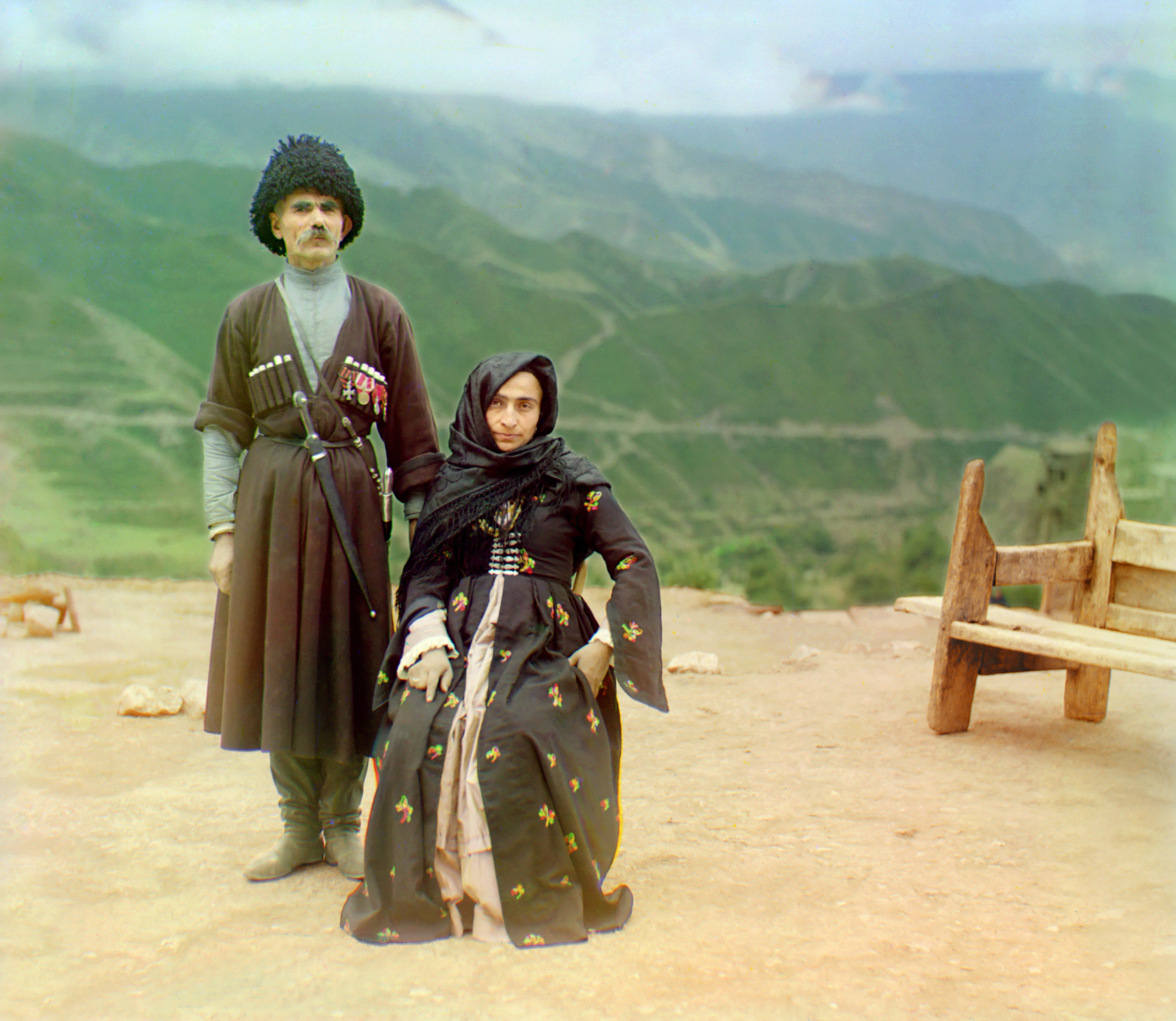
A Dagestani couple in the Caucasus mountains.
The entrance to the Passage of the Dead, Samarkand.
Kebab house, Samarkand.
Fabric merchant, Samarkand.
Prisoners in shackles.

Peasant girls in the Ural mountains.
As you might have noticed already, Prokudin-Gorsky's tri-color technique leaves some visual artifacts in the images - since it was impossible to align the colors perfectly, certain patches of yellow, red, green or blue bleed over from time to time. Some see these as mistakes in need of restoration, but they are actually a big part of why I love these images so much - I really like the combination of vivid, crisp realism and randomly-produced abstraction. Below are a few of my favorite 'damaged' images so you can see what I mean: