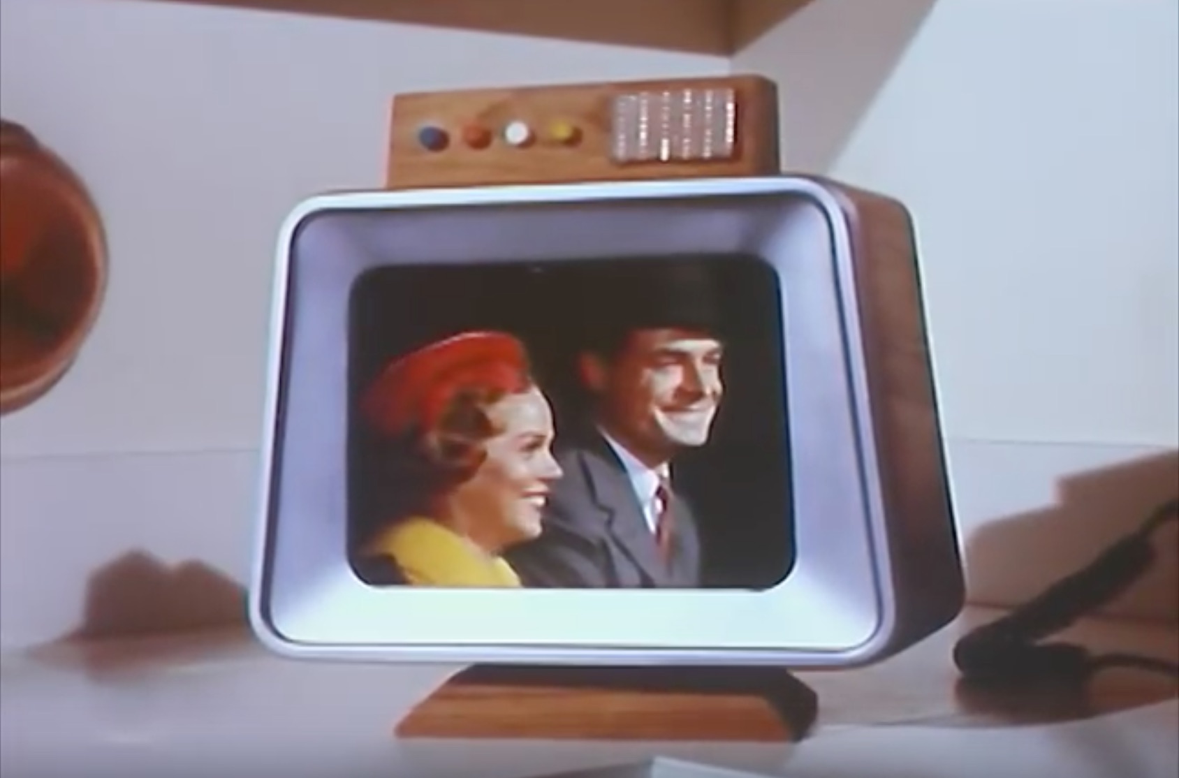
The situation is similar when it comes to other parts of the house: bold technological claims that would sound prosaic within the lifetimes of the actors involved. The film hypes the washer/dryer unit as a "program computer... that can think," but it's actually just a push-button system that has different settings for different types of clothing.
By contrast, the combination barbecue and fireplace (!) looks far less dated than the other elements in the house, as does the beautiful living room. The most futuristic elements of this home aren't the "thinking machines" – they're the elements of mid-century modern design, mostly made out of age-old materials like copper and wood.
 |
| Detail from a Westinghouse promotional brochure. |
The Westinghouse Electric Home shown in this film was for show, but many elements of 1950s smart home design aesthetics and technology did end up in production.
The science fiction author Robert Heinlein and his wife Virginia were profiled in one representative example in the
June, 1952 issue of Popular Mechanics. The Heinlein's Colorado Springs house was their own take on a connected home of the future:
Their home in Bonny Noon, California, near the UC Santa Cruz campus, continued the same style.
 |
| Courtesy UC Santa Cruz Special Collections. (Fun fact – the other photographs in this folder were candid shots of a young L. Ron Hubbard!) |
From my perspective, the most futuristic thing about these homes is not "cybernetic" circuitry and electronic gizmos of the technology itself – it's the design sensibility of such decidely non-high tech elements as wood, copper, and paint.
* * *
A home of the year 2119 will almost certainly not include "smart" products made by Amazon or Apple (when was the last time you bought a Westinghouse appliance?). But there's a decent chance that it will include furniture inspired by mid-century modern aesthetics. Aesthetic modes can be surprisingly persistent, even as technologies change – in historian
Fernand Braudel's terms, design styles are often multi-generational "conjunctures" spanning several decades or even centuries. These can easily outlast the more rapidly-passing "history of events."
A favorite example: The
"Crakow" or "Poulaine" style of shoe – you might not know the name, but you probably know the look. It's the curly-toed, long-pointed footwear that you might recognize from medieval manuscripts or from historical films, Renaissance fairs, and the like.
There's no technological rationale for these absurdly long shoes: they are simply a fashion choice. But it proved to be a fashion that was amazingly persistent, originating in the twelfth century and not falling out of style until the childhood of Henry VIII (that's over 300 years).
Or take the design of radios and televisions throughout the first six decades of the twentieth century.
Cutting-edge products of modern technology, yes. But a form of technology that gets disguised in carved wooden cabinets that look straight out of the nineteenth century.
 |
| A 1951 magazine advertisement for a Zenith "Black Magic" television. |
Perhaps the most prescient twentieth-century vision of a smart home isn't from a commercial or promotional video promising specific technologies. It's from Stanley Kubrick's 2001: A Space Odyssey, when the astronaut David Bowman finds himself in a sort of alien-designed observation room, where he lives out the rest of his life.
As Michael Benson writes in his excellent recent book about the making of 2001, Kubrick and Arthur C. Clark's vision of the final space in the film was "supposed to have overtones of a holding tank or zoo cage." They tried out various space-age design elements for this "hyperreal hotel room," but in the end they settled on something oddly traditional: Louis XVI furniture, muted paint tones, and decorative objects that look like something Queen Victoria might nod approvingly at.
It's safe to say that Kubrick's alien hotel room is not a good guide to what the homes of the future will actually look like. But I think that Kubrick intuitively grasped something that his space-age peers did not: technology changes far more quickly than aesthetics does.
We might not have fussy Victorian-style furniture or Danish modernist tables in space, but then again – maybe we will.


